Balance by Béres Alexandra

Packaging design
Visual identity, logo and packaging design for Balance by Béres Alexandra.
Industry experience
Beauty and skincare (10+ év)
Services
Brand Design
Packaging design
Industry experience
Beauty and skincare (10+ év)
Services
Brand Design
Packaging design
Date
2023

The story

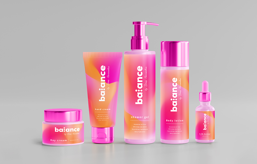
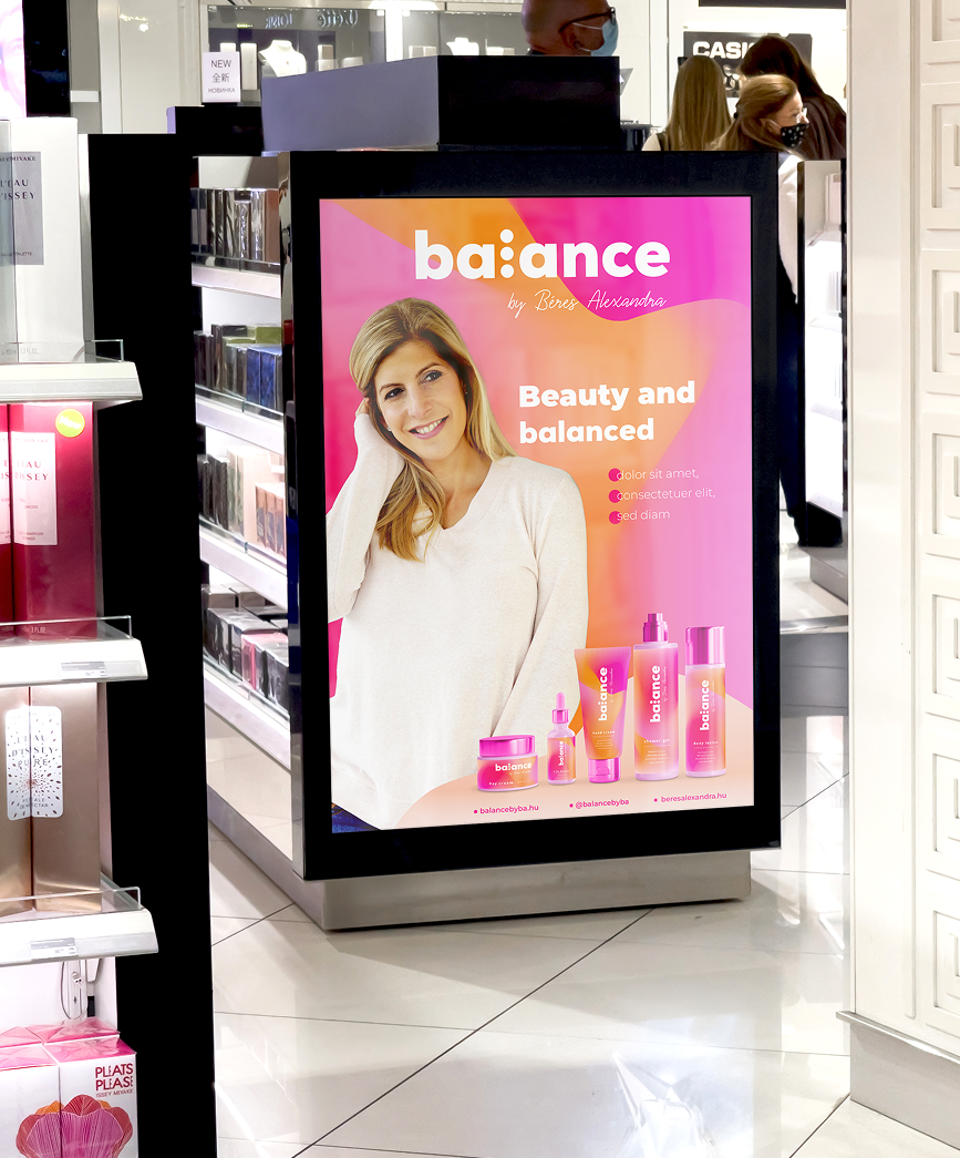
When developing the visual identity for Balance by Béres Alexandra, our goal was to translate the idea of inner and outer balance into a modern, feminine and energetic skincare brand. The identity is built around mindfulness, self-care and the positive, inspiring mindset that also reflects Alexandra Béres’ personal philosophy. The logo, packaging and overall visual system were therefore designed as one coherent world that communicates freshness, optimism and premium quality.

The details

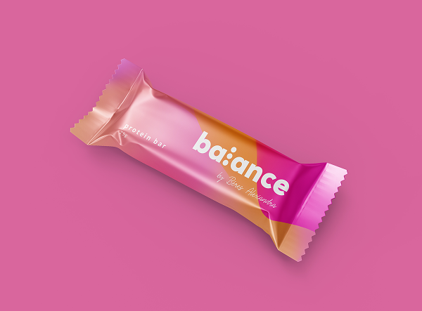
The clean, distinctive typography of the Balance logo is complemented by three dots, representing three interconnected dimensions of the brand’s philosophy: body, mind and care. Their rhythm also suggests the continuous search for balance, personal growth and change. This idea is carried through into the fluid, organic background system, where shades of pink, coral and orange blend into one another to express movement, flexibility and natural harmony. Instead of rigid, static geometry, the identity uses a softly evolving visual language that reflects the sensory and personal nature of skincare.


In the packaging design, this sense of fluidity is combined with a bold, recognisable colour palette and clean typography. The different formats within the product range work together as a unified system while allowing each product to retain its own character. Vivid pink details, warm gradients and white typography create a fresh, contemporary appearance that feels both feminine and confident without becoming overly decorative. The result is a skincare brand that visually communicates the idea that balance is not a fixed state, but an ongoing and personal process.